Ready for the creative century?
KNSK
SERVICES
▷ Visual Identity
▷ Motion Design
▷ Tone of Voice
Bold Ideas Need Freedom to Thrive.
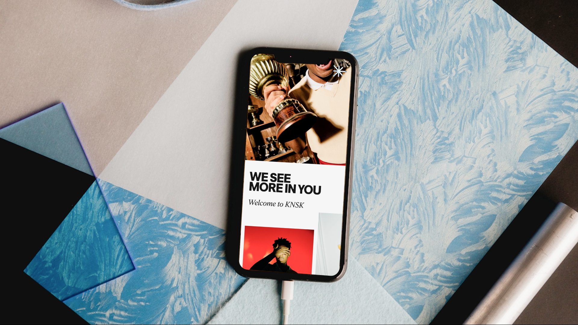
The new KNSK branding positions the agency with striking clarity and confidence, anchored in a bold and powerful visual foundation. At the same time, it embraces moments of creative freedom. Through expressive typography, dynamic motion, striking photography, and playful graphic elements it is allowing the brand to break boundaries and explore ideas. The identity balances a strong, clear core with bursts of creativity, reflecting KNSK’s independent spirit and entrepreneurial mindset while giving space for creativity and cultural expression.
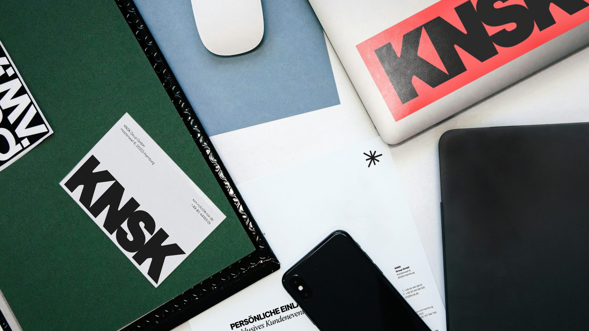
At the heart of the system lies the wordmark: bold, precise, and unmistakable. Its sharp edges and soft curves create an iconic signature that balances confidence with warmth. Alongside it stands the signet Lumi: a star of three converging arrows symbolizing orientation, focus, and clarity, placing the clients at the center. Together, the wordmark and Lumi form a distinctive visual language that is both modern and timeless.
Strategy
In this next phase, KNSK partnered with Serotonin Studio from Hamburg to rethink its strategy and positioning, setting a sharper course for the agency’s future. Building on this foundation, Hyperfocus developed a new brand identity that translates ambition into a clear and confident visual language.
The rebrand highlights KNSK’s independence, creative authority, and modern culture, while also strengthening its role as both an innovative partner for clients and an attractive employer brand.
Together, this collaborative process ensures that KNSK’s identity is more than a design refresh. It is a strategic tool to reinforce market presence, inspire the team, and support long-term growth.
The Design System
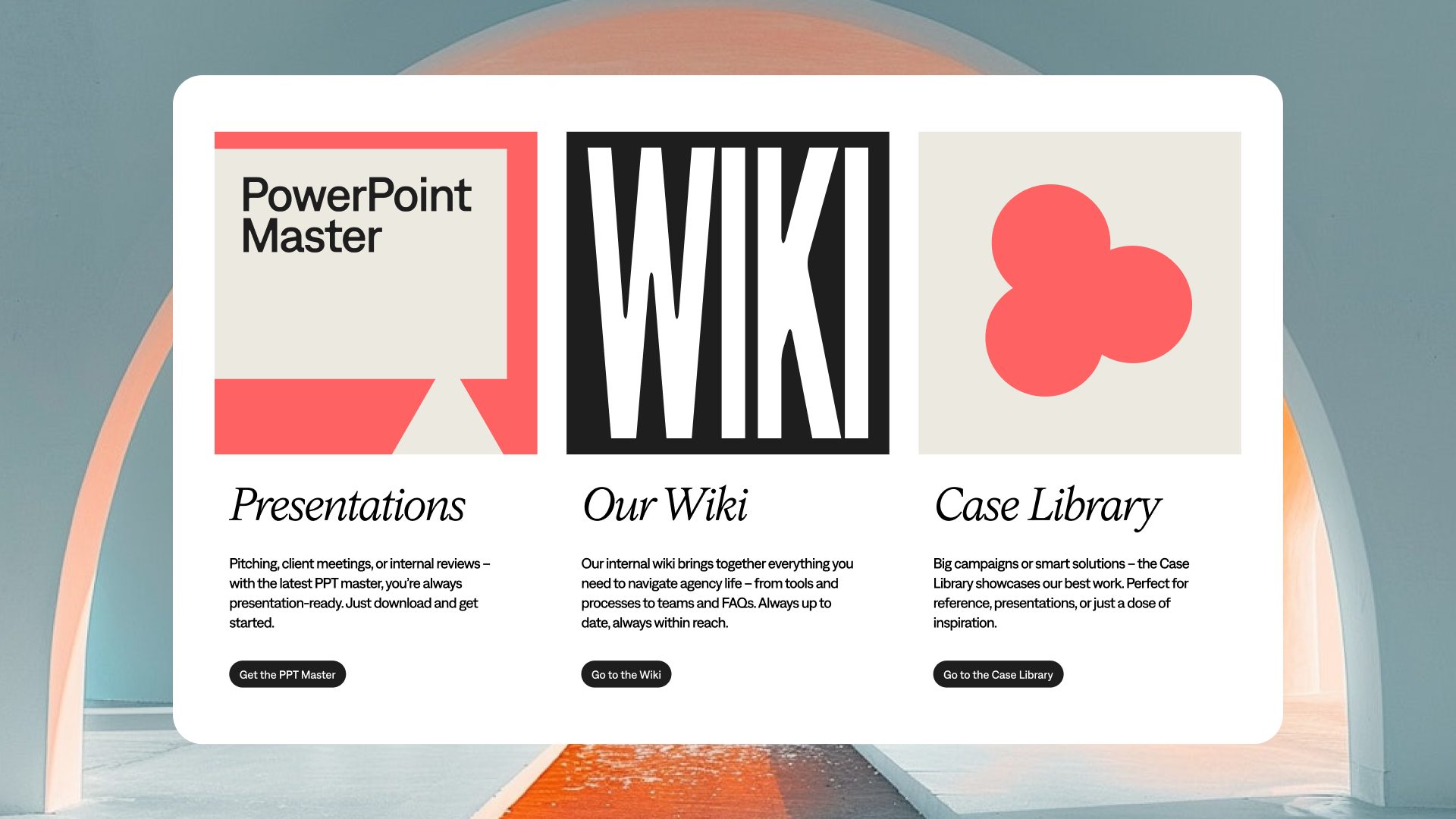
The design system is further defined by a dual typographic voice: the expressive grotesque Denim INK by Displaay Type Foundry and the elegant serif Silvana Text by Blaze Type. Used in equal measure, they combine bold self-assurance with creative flexibility and expressivity.
Colour Palette
The reduced color palette reinforces this clarity with Bold Black, Clarity White, and Warm Beige, while the refined KNSK Red provides a confident accent.
Imagery
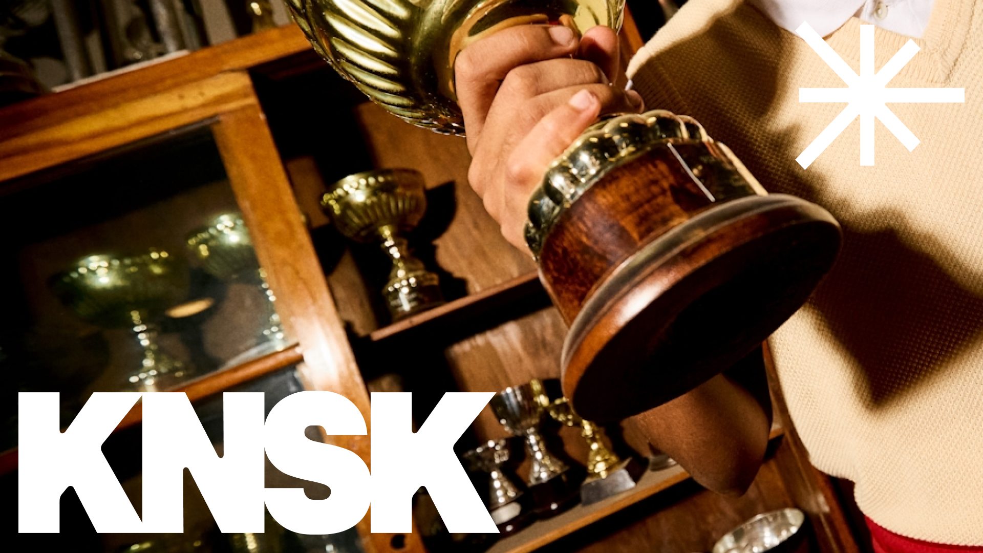
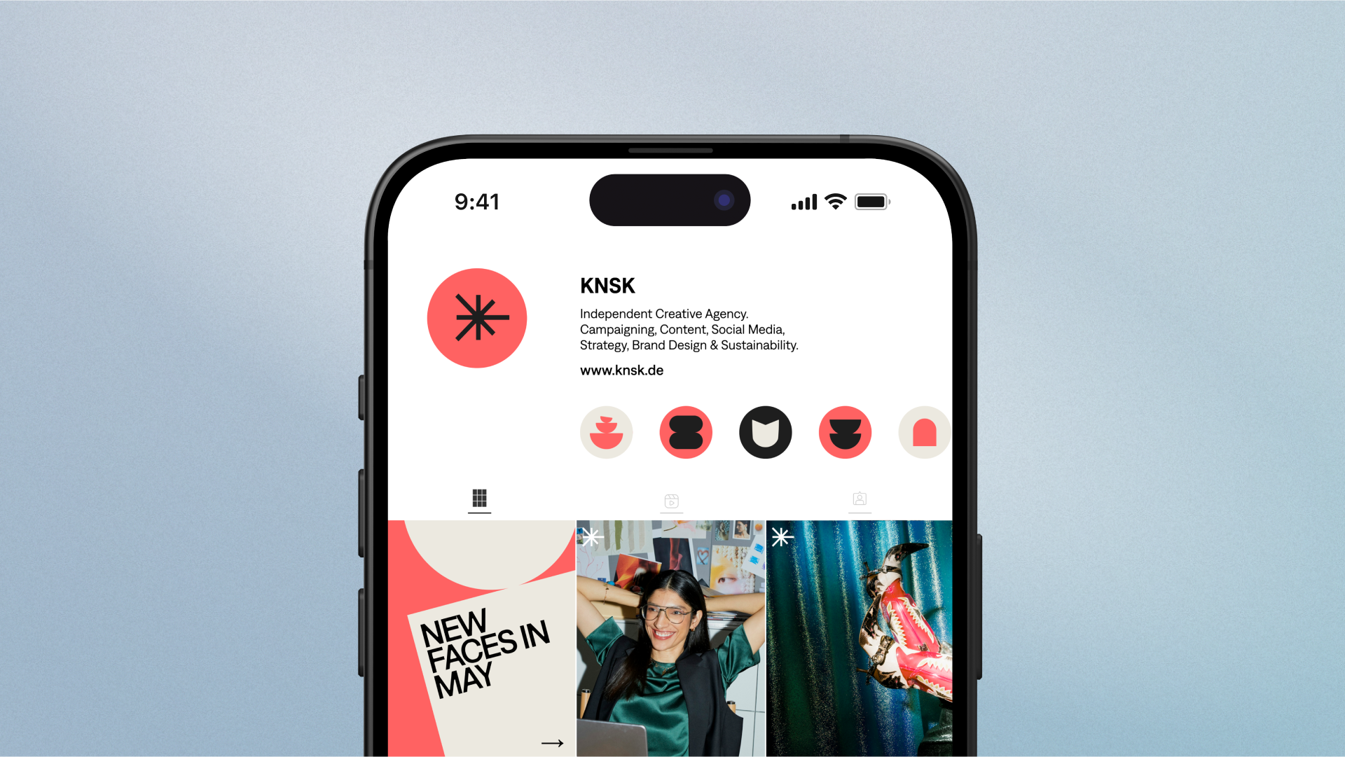
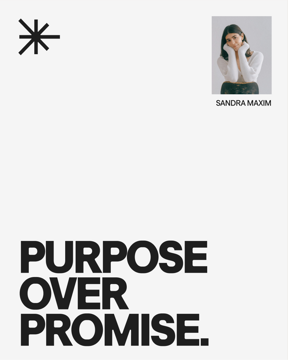
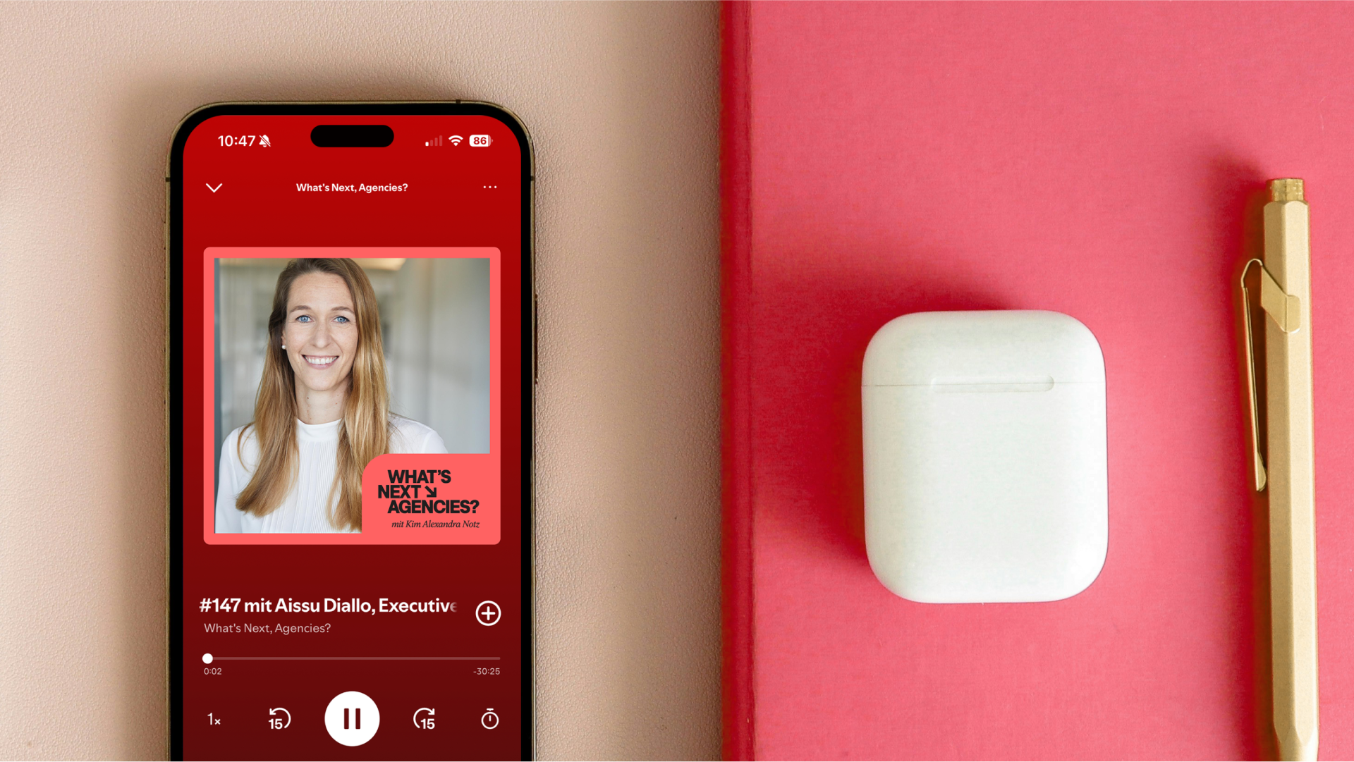
KNSK’s imagery is powerful and character-driven, never staged or over-produced. It unfolds in three styles: authentic Editorial Portraits, raw and spontaneous Cultural Snapshots, and conceptual Still Life compositions. Together, they create a world that is striking, human, and culturally connected.

Motion
Motion brings the system to life, following clear principles that balance boldness with purpose. The wordmark condenses with strength and focus, while Lumi emerges as three arrows converging at the center: precise, clear, and guiding. Graphic elements flow in a calm, continuous rhythm, adding dynamism without chaos.
Typography takes on an expressive presence: sometimes loud, sometimes functional, always engaging, and full of character. This interplay of movement and stillness creates a dynamic brand that frames content with clarity while leaving enough space for expressive creativity.

We’re always on the lookout for creative talents and collaborations with new clients. Are you one of those?
Let’s connect.
hi[@]hyperfocus.cc
Hyperfocus GmbH
Eppendorfer Weg 95a
20259 Hamburg
Germany
©2026 Hyperfocus