1,300+ companies worldwide rely on WhereverSIM
WhereverSim
SERVICES
▷ Visual Identity
▷ Motion Design
▷ Tone of Voice
▷ 3D Design
From its startup roots in 2002, WhereverSIM has grown exponentially and now holds bold ambitions to become the market leader in its category.
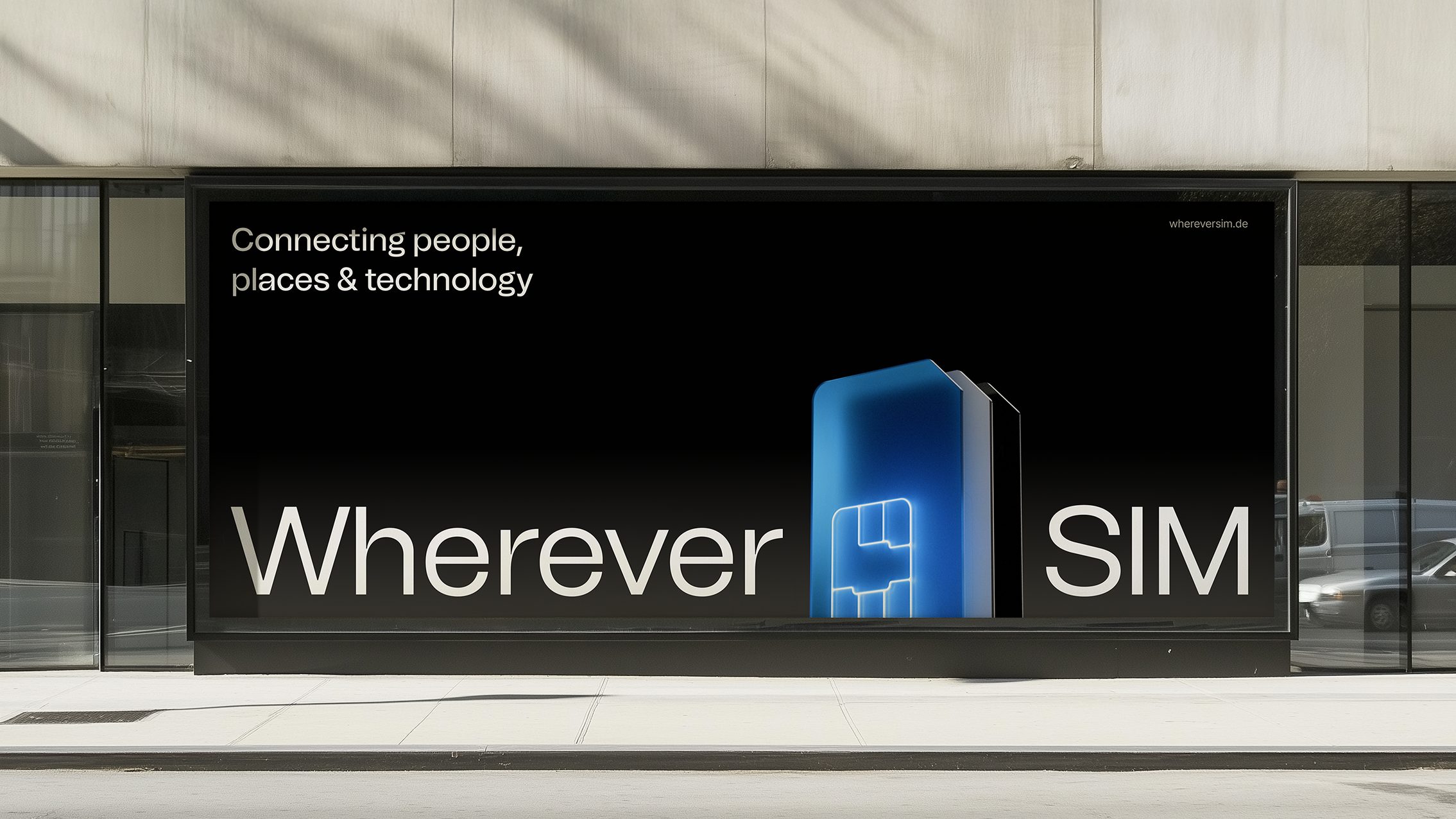
Our ongoing partnership began with a complete rebrand, starting with the development of their brand strategy to help redefine their mission and sharpen their positioning.
In a market flooded with indistinguishable competitors, our goal was to create a brand that breaks the mould, one that’s bold, memorable, and unapologetically different. A brand built to shake up the category and firmly position WhereverSIM as the clear first choice.
Overview
A global rebrand for WhereverSIM, a German IoT SIM card company. This marks the beginning of an ongoing partnership as we continue to evolve both product and brand pushing them into new categories and markets.
Current
WhereverSIM’s technology is now powering millions of devices worldwide, seamlessly connecting IoT solutions across industries and borders.
Strategy
As part of the branding project, we developed a focused and future-oriented brand strategy that clearly positions the company as the go-to partner for intuitive and reliable IoT connectivity. At the heart of the strategy is a simple but powerful promise: to make IoT effortless, so customers can fully focus on their craft. The vision, a world where connectivity just works, down to the last detail, is reflected in every touchpoint.
With over a decade of hands, on experience, in-house development, and a strong customer first mindset, the brand stands for clarity, flexibility, and trust. The core values, reliable, understanding, and enthusiastic, form the cultural and communicative backbone of the brand.
The new claim, “Connecting IoT. Empowering You.”, encapsulates the mission: enabling companies through seamless technology and standout service.

Typography
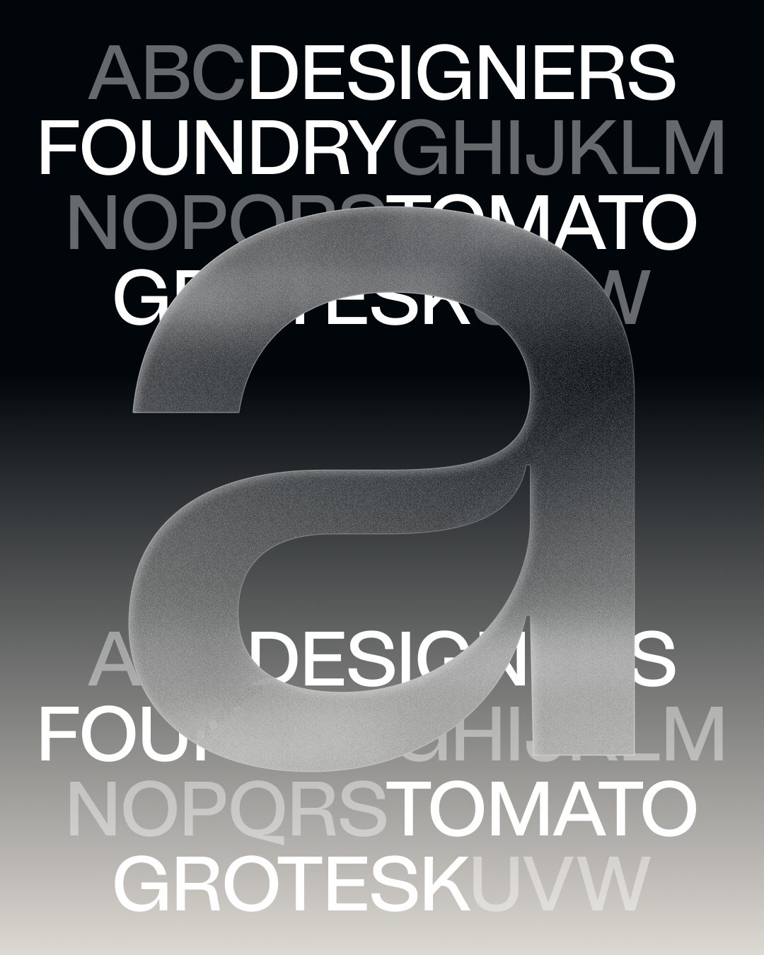
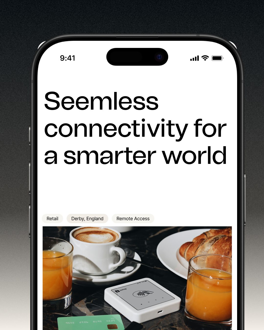
Tomato Grotesk perfectly balances clean lines, clarity and versatile functionality with an intruiging humanity with its varying stroke width and unexpected curves. Giving WhereverSIM a unique, warm and contemporary blend that aligns with their personality.


Motion
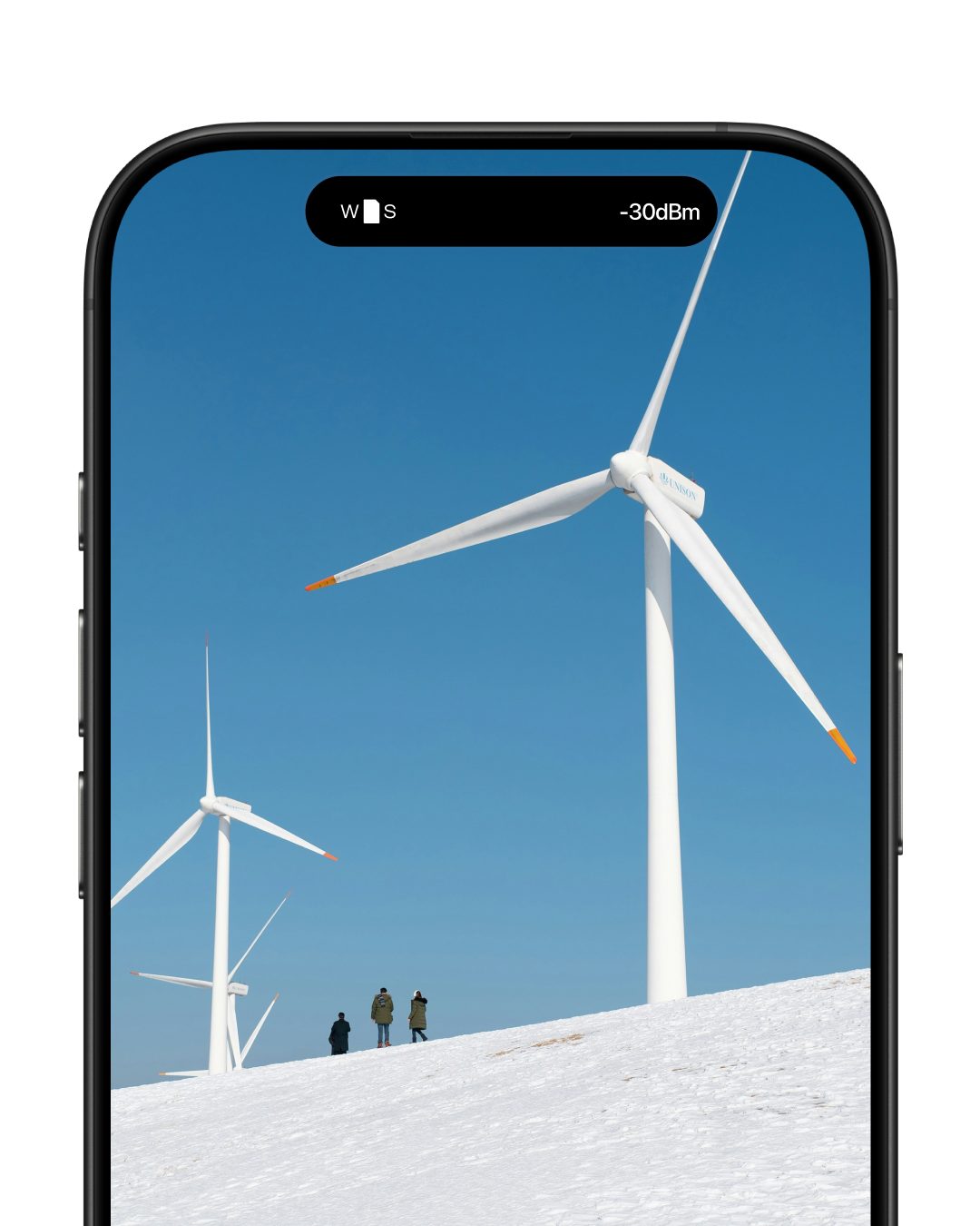
Our motion concept revolves around a dynamic balance of gentle and energetic movements, inspired by the flow between fast connection/tech-innovation and the human service.

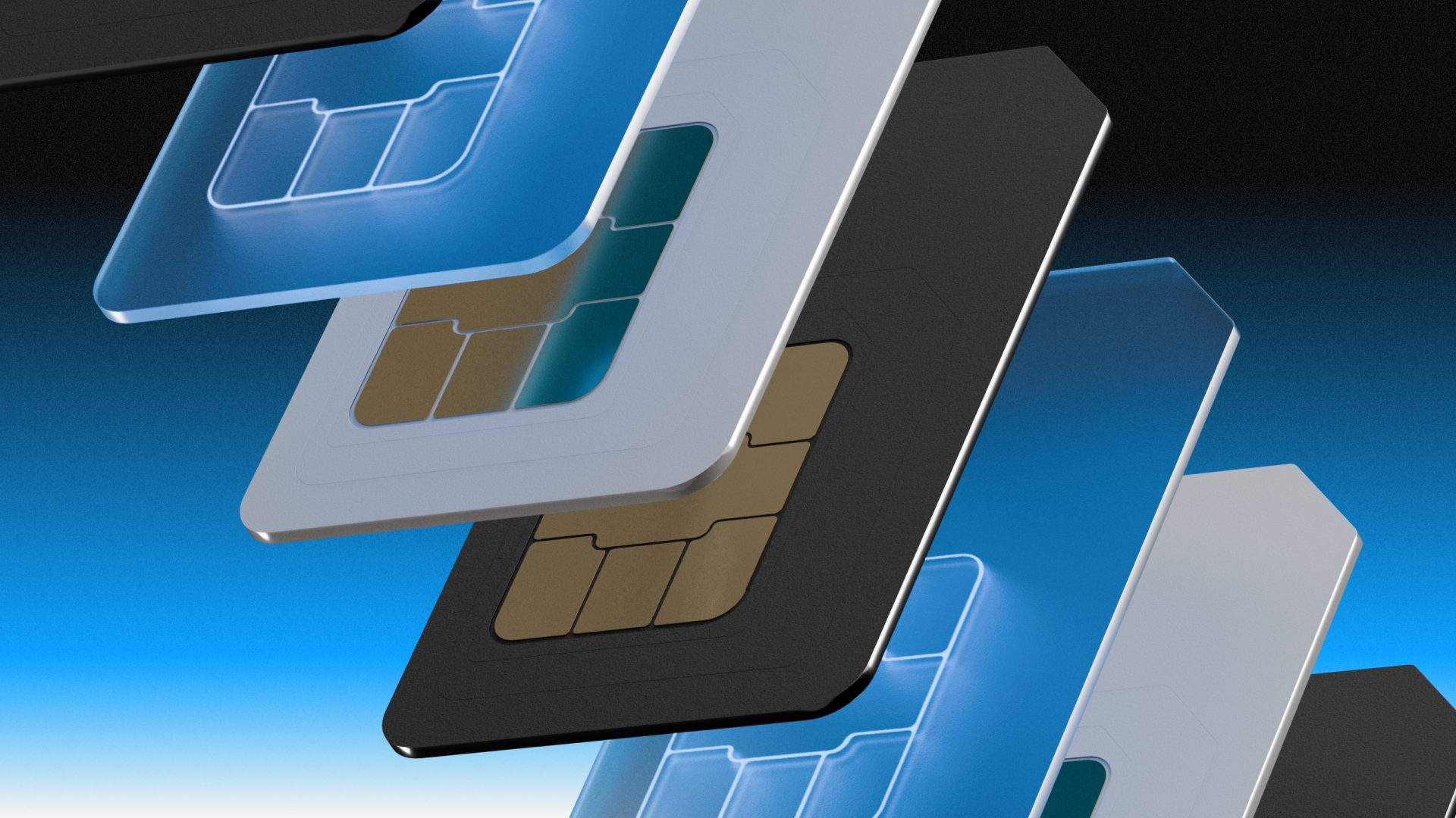
Frosted Glass
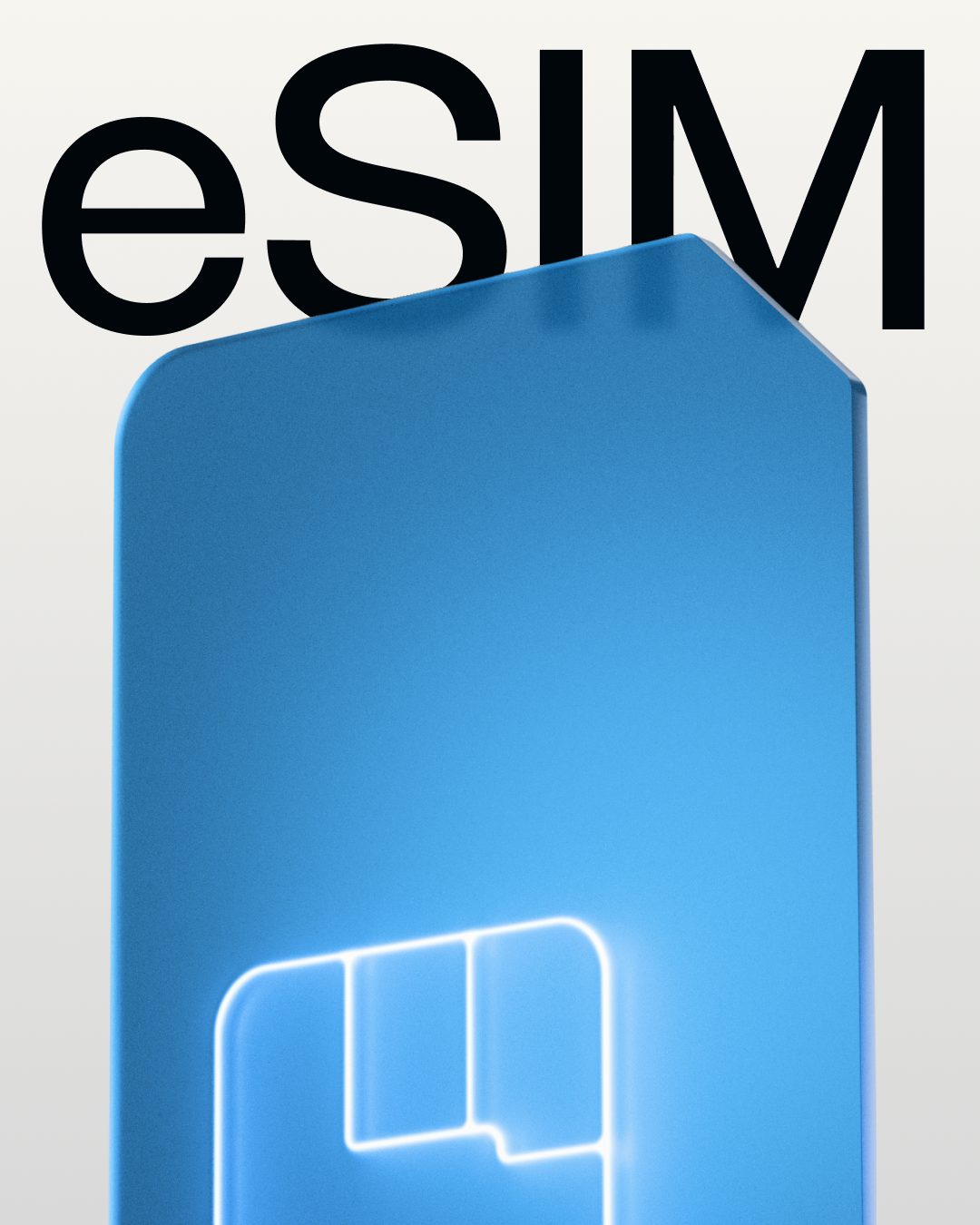
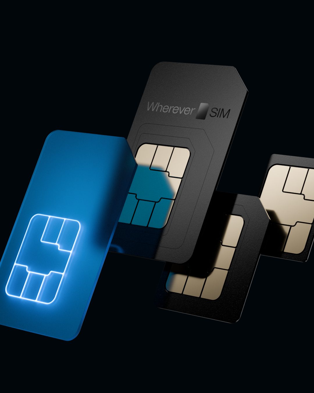
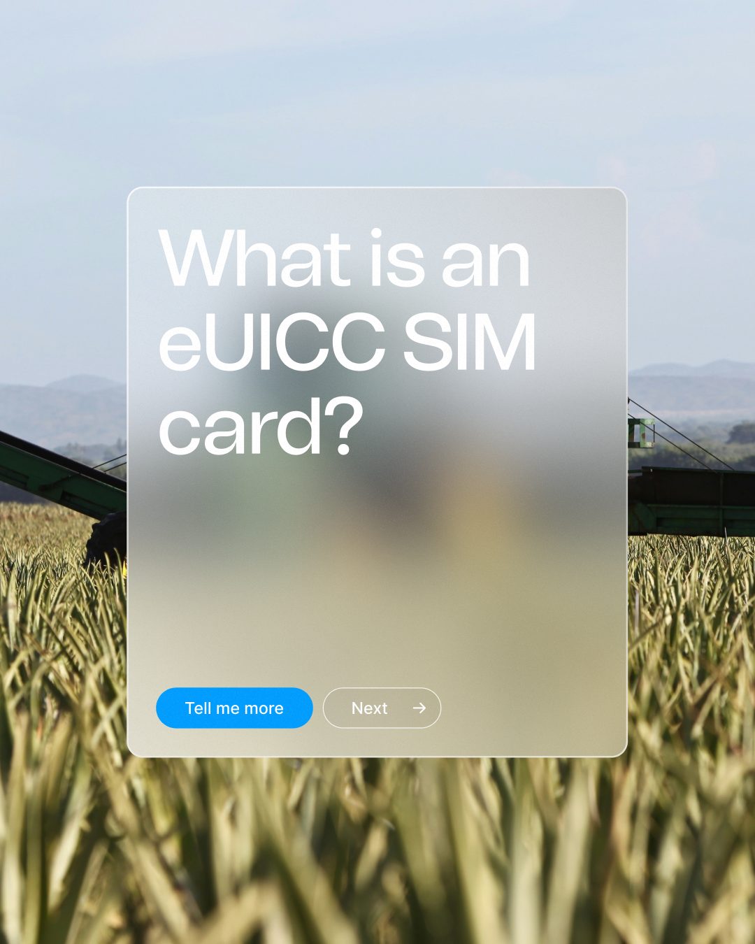
To visually represent the transparency and openness of the company, we introduced a frosted glass effect. This element is used throughout the UI and forms the foundation of the illustration style. In each illustration, WhereverSIM is represented by a blue core, surrounded by frosted glass that keeps it visible through the surface. This layering places the brand at the heart of the visual language.
Our Voice
To ensure a consistent and authentic brand experience, we translated our core values into a distinct tone of voice. WhereverSIM communicates clearly, directly, and with a human touch, always focused on solutions, never on complexity.
Our language reflects who we are: reliable, understanding, and genuinely enthusiastic. Across all channels and formats, the way we speak reinforces the trust we aim to build with every interaction.
At the same time, the tone of voice is designed to be adaptable across 10 international languages – ensuring clarity and consistency in every market we serve.
We’re always on the lookout for creative talents and collaborations with new clients. Are you one of those?
Let’s connect.
hi[@]hyperfocus.cc
Hyperfocus GmbH
Eppendorfer Weg 95a
20259 Hamburg
Germany
©2026 Hyperfocus